The Button Widget
Table of Contents
Buttons
The button widget is a simple widget that emits several signals in response to user action. Generally it is used to attach a function to that is called when the button is pressed. The various signals and how to use them are outlined below.A button can be created with one of the following constructors:
Button();


Button(Gtk::Image& image);


Button(const char *label, bool use_underline = false);


Button(Gtk::Image& image, const String& label, bool
use_underline = false, bool horizontal = false);


Button(const Gtk::StockId& stock_id);
The first constructor creates an empty button which can hold any valid child widget. The second constructors create a button that displays a Gtk::Image. The third constructor creates a button that displays a text label. If 'use_underline' is true the string is parsed for an underscore preceding the mnemonic character. The fourth constructor creates a button that displays a Gtk::Image and a text label. If 'horizontal' is true the text is displayed beside the image; otherwise its displayed underneath. The fifth constructor creates a button that displays a stock image and its label.
If you create an empty button you can call the following set methods to set the button contents:
 void set_label(const String& label);


void set_stock_id(const Gtk::StockId& stock_id);


void set_image(Gtk::Image& image, const String& label, bool
use_underline = false, bool horizontal = false);
You can set and retrieve the button relief style by calling the following methods, respectively:
void set_relief(Gtk::ReliefStyle
newstyle);


Gtk::ReliefStyle get_relief() const;
The 'newstyle' argument can be one of the following values from the Gtk::ReliefStyle enum:
- RELIEF_NORMAL
- RELIEF_HALF
- RELIEF_NONE
void set_focus_on_click(bool
focus_on_click);
If 'focus_on_click' is set to true, the button grabs the focus when clicked with the mouse.
If the button's child widget is of type GTK_TYPE_MISC (an image or label) or GTK_TYPE_ALIGNMENT you can set its vertical and horizontal alignment, by calling:
void set_alignment(float xalign, float
yalign);
You can connect callback slots to one or more button signals using the following Gtk::Button proxy signal functions:
- signal_pressed() - emitted when the button is initially pressed.
- signal_released() - emitted when a button which is pressed is released.
- signal_clicked() - emitted when a button clicked on by the mouse.
- signal_enter() - emitted when the mouse cursor enters the region of the button.
- signal_leave() - emitted when the mouse cursor leaves the region of the button.
- signal_activate() - emitted when the button is activated.
Image Button Example
Here's an example of a button that displays
and image with a text label beside it, using the fourth constructor
above. The header file for this example is <buttons.hh>:
and the source file is <buttons.cc>:
Compiling Image Button
If you compiled and installed XFC yourself, you will find the source
code for Image Button in the
<examples/buttons> source directory along with a Makefile. If
XFC came pre-installed, or you installed it from an RPM package, you
will
find the source code in the
</usr/share/doc/xfcui-X.X/examples/buttons> subdirectory. In
this case you will have to create the Makefile yourself (replace X.X
with the
version number of the libXFCui library you have installed).
To create a Makefile for Image Button, add the following lines to a new text file and save it using the name "Makefile":
If you cut and paste these lines make sure the whitespace before $(CC) and rm is a tab character. When you compile and run this program you will see the following window appear:
#include <xfc/main.hh>

#include <xfc/gtk/window.hh>


using namespace Xfc;


class ButtonWindow : public Gtk::Window

{

protected:

    virtual void on_clicked();


public:

    ButtonWindow();

    virtual ~ButtonWindow();

};
and the source file is <buttons.cc>:
#include "buttons.hh"

#include <xfc/gtk/box.hh>

#include <xfc/gtk/button.hh>

#include <xfc/gtk/image.hh>

#include <xfc/gtk/label.hh>

#include <iostream>


// ButtonWindow


ButtonWindow::ButtonWindow()

{

    set_title("Image Button!");

    set_border_width(10);


    // Create an image from an XPM file


    Gtk::Image *image = new Gtk::Image("info.xpm");


    // Create a new button

    Gtk::Button *button = new Gtk::Button(*image, "cool
button", false, true);


    add(*button);

    button->show();

}


ButtonWindow::~ButtonWindow()

{

}


void

ButtonWindow::on_clicked()

{

    std::cout << "Hello again - cool button was
pressed" << std::endl;

}


int main(int argc, char *argv[])

{

    using namespace Main;


    init(&argc, &argv);


    ButtonWindow window;


 window.signal_destroy().connect(sigc::ptr_fun(&Xfc::Main::quit));

    window.show();


    run();

    return 0;

}
Compiling Image Button
If you compiled and installed XFC yourself, you will find the source
code for Image Button in the
<examples/buttons> source directory along with a Makefile. If
XFC came pre-installed, or you installed it from an RPM package, you
will
find the source code in the
</usr/share/doc/xfcui-X.X/examples/buttons> subdirectory. In
this case you will have to create the Makefile yourself (replace X.X
with the
version number of the libXFCui library you have installed).To create a Makefile for Image Button, add the following lines to a new text file and save it using the name "Makefile":
CC = g++


CFLAGS = -Wall -O2


buttons: buttons.cc buttons.hh

    $(CC) buttons.cc -o buttons $(CFLAGS) `pkg-config
xfcui-X.X --cflags --libs`


clean:

    rm -f *.o buttons
If you cut and paste these lines make sure the whitespace before $(CC) and rm is a tab character. When you compile and run this program you will see the following window appear:
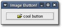
To make sure the button displays
the pixmap, launch the program from a commnad shell.
Toggle buttons are the basis for check buttons and radio buttons, as such, many of the calls used for toggle buttons are inherited by radio and check buttons. These will be pointed out when we come to them.
To create a toggle button you can use one of the following constructors:
The first constructor creates an empty toggle button, and the second creates a toggle button with a label widget already packed into it. If 'use_underline' is true, the label is parsed for an underscore preceding the mnemonic character. If you create an empty toggle button you can call one of the Gtk::Button set methods to set the button contents.
To retrieve the state of the toggle widget, including radio and check buttons, we use a construct as shown in the example below. This tests the state of the toggle button, by calling its get_active() function. The signal of interest to us emitted by toggle buttons (toggle button, check button, and radio button widgets) is the "toggled" signal. There are two ways to check for the state of these buttons.
The "toggled" signal expects a signal handler that takes no arguments. Since on_button_toggled() takes a toggle button pointer, you have to bind the pointer to the slot so that it gets passed to on_button_toggled() every time a "toggled" signal is emitted.
To check the state of the toggle button use the following construct:
Pass in true or false for the 'is_active' argument to specify whether it should be down (depressed) or up (released). Default is up, or false. Note that when you use the set_active() method, and the state is actually changed, it causes the "clicked" and "toggled" signals to be emitted from the button.
The get_active() function returns the current state of the toggle button as a bool (true or false) value.
The constructors are similar to those of the regular buttons:
The second constructor creates a check button with a label beside it. Checking the state of the check button is identical to that of the toggle button.
Toggle Buttons
Toggle buttons are derived from normal buttons and are very similar, except they will always be in one of two states, alternated by a click. They may be depressed, and when you click again, they will pop back up. Click again, and they will pop back down.Toggle buttons are the basis for check buttons and radio buttons, as such, many of the calls used for toggle buttons are inherited by radio and check buttons. These will be pointed out when we come to them.
To create a toggle button you can use one of the following constructors:
ToggleButton();


ToggleButton(const String& label, bool use_underline = false);
The first constructor creates an empty toggle button, and the second creates a toggle button with a label widget already packed into it. If 'use_underline' is true, the label is parsed for an underscore preceding the mnemonic character. If you create an empty toggle button you can call one of the Gtk::Button set methods to set the button contents.
To retrieve the state of the toggle widget, including radio and check buttons, we use a construct as shown in the example below. This tests the state of the toggle button, by calling its get_active() function. The signal of interest to us emitted by toggle buttons (toggle button, check button, and radio button widgets) is the "toggled" signal. There are two ways to check for the state of these buttons.
- Derive your own class from the Gtk::ToggleButton and Gtk::ToggleButtonSignals and override it's protected on_toggled() virtual signal handler.
- Create an instance of the Gtk::ToggleButton class and
connect a
slot through it's "toggled" proxy signal function.
Gtk::ToggleButton
*button = new Gtk::ToggleButton("Button");

button->signal_toggled().connect(sigc::bind(sigc::mem_fun(this,
&MyClass::on_button_toggled), button));
The "toggled" signal expects a signal handler that takes no arguments. Since on_button_toggled() takes a toggle button pointer, you have to bind the pointer to the slot so that it gets passed to on_button_toggled() every time a "toggled" signal is emitted.
To check the state of the toggle button use the following construct:
void

MyClass::on_button_toggled(Gtk::ToggleButton *button)

{

    if
(button->get_active())

    {

        // If
control reaches here, the toggle button is down

    }

    else

    {

        // If
control reaches here, the toggle button is up

    }

}
void
set_active(bool is_active);
Pass in true or false for the 'is_active' argument to specify whether it should be down (depressed) or up (released). Default is up, or false. Note that when you use the set_active() method, and the state is actually changed, it causes the "clicked" and "toggled" signals to be emitted from the button.
bool
get_active() const;
The get_active() function returns the current state of the toggle button as a bool (true or false) value.
Check Buttons
Check buttons inherit many properties and functions from the toggle buttons above, but look a little different. Rather than being buttons with text inside them, they are small squares with the text to the right of them. These are often used for toggling options on and off in applications.The constructors are similar to those of the regular buttons:
 CheckButton();


CheckButton(const String& label, bool
use_underline = false);
The second constructor creates a check button with a label beside it. Checking the state of the check button is identical to that of the toggle button.
Radio Buttons
Radio buttons are similar to check buttons except they are grouped so that only one may be selected (depressed) at a time. This is good for places in your application where you need to select from a short list of options.Radio button widgets are created by calling one of the following constructors:
RadioButton();


RadioButton(const RadioButton *group);


RadioButton(const RadioButton *group, const String& label, bool
use_underline = false);
The first constructor creates a new radio button in a new group. To be of any practical value, a widget should be packed into the radio button. The second constructor creates a new radio button and adds it to the same group that 'group' is a member of. The third constructor does the same as the second but it also lets you set the radio button label. You can pass null as the 'group' argument if the radio button is the first in a group. In subsequent calls, a radio button from the group you wish to add this button to should be passed as an argument.
Alternatively, you can set and retrieve the group a RadioButton is assigned to by calling the following methods respectively:
void set_group(Group *group);


Group* get_group() const;
Group is just a typedef for the real group, a GSList. The group list does not need to be freed, as each RadioButton will remove itself and its list item when it is destroyed.
It is also a good idea to explicitly set which button in the group should be the default selected button with the Gtk::ToggleButton method:
void
set_active(bool is_active);
Radio Button Example
Here is a simple program that displays a window containing three radio buttons. The header file for this example is <radiobutton.hh>#include <xfc/main.hh>
#include <xfc/gtk/window.hh>
#include <xfc/gtk/radiobutton.hh>
using namespace Xfc;
class RadioButtonWindow : public Gtk::Window
{
void on_toggled(const Gtk::RadioButton *button);
public:
RadioButtonWindow();
~RadioButtonWindow();
};and the source file is <radiobutton.cc>
#include "radiobuttons.hh"

#include <xfc/gtk/box.hh>

#include <xfc/gtk/separator.hh>

#include <iostream>


RadioButtonWindow::RadioButtonWindow()

{

    set_title("Radio Buttons");

    set_border_width(0);


    Gtk::VBox *box1 = new Gtk::VBox;

    add(*box1);

    box1->show();


    Gtk::VBox *box2 = new Gtk::VBox(false, 10);

    box2->set_border_width(10);

    box1->pack_start(*box2);

    box2->show();


    // When adding the first radio button to a group
pass null for the group paramter.

    Gtk::RadioButton *radio_button = 0;

    radio_button = new Gtk::RadioButton(radio_button,
"button1");


 radio_button->signal_toggled().connect(sigc::bind(sigc::mem_fun(this,
&RadioButtonWindow::on_toggled), radio_button));

    box2->pack_start(*radio_button);

    radio_button->show();


    // Then, pass a pointer to a radio button already in
the group to the constructor of the other buttons.

    radio_button = new Gtk::RadioButton(radio_button,
"button2");


 radio_button->signal_toggled().connect(sigc::bind(sigc::mem_fun(this,
&RadioButtonWindow::on_toggled), radio_button));

    radio_button->set_active(true);

    box2->pack_start(*radio_button);

    radio_button->show();


    radio_button = new Gtk::RadioButton(radio_button,
"button3");


 radio_button->signal_toggled().connect(sigc::bind(sigc::mem_fun(this,
&RadioButtonWindow::on_toggled), radio_button));

    box2->pack_start(*radio_button);

    radio_button->show();


    Gtk::HSeparator *separator = new Gtk::HSeparator;

    box1->pack_start(*separator, false);

    separator->show();


    box2 = new Gtk::VBox(false, 10);

    box2->set_border_width(10);

    box1->pack_start(*box2, false);

    box2->show();


    Gtk::Button *button = new Gtk::Button("close");


 button->signal_clicked().connect(sigc::mem_fun(this,
&RadioButtonWindow::dispose));

    box2->pack_start(*button);

    button->set_flags(Gtk::CAN_DEFAULT);

    button->grab_default();

    button->show();

}


RadioButtonWindow::~RadioButtonWindow()

{

}


void

RadioButtonWindow::on_toggled(const Gtk::RadioButton *button)

{

    if (button->get_active())

        std::cout << "Selected:
radio " << button->get_label() << std::endl;


}


int main (int argc, char *argv[])

{

    using namespace Main;


    init(&argc, &argv);


    RadioButtonWindow window;


 window.signal_destroy().connect(sigc::ptr_fun(&Xfc::Main::quit));

    window.show();


    run();

    return 0;

}
Compiling Radio Button
If you compiled and installed XFC yourself, you will find the source
code for Radio Button in the
<examples/radionbuttons> source directory along with a Makefile.
If
XFC came pre-installed, or you installed it from an RPM package, you
will
find the source code in the
</usr/share/doc/xfcui-X.X/examples/radionbuttons> subdirectory.
In
this case you will have to create the Makefile yourself (replace X.X
with the
version number of the libXFCui library you have installed).To create a Makefile for Radio Button, add the following lines to a new text file and save it using the name "Makefile":
CC = g++


CFLAGS = -Wall -O2


radiobuttons: radiobuttons.cc radiobuttons.hh

    $(CC) radiobuttons.cc -o radiobuttons $(CFLAGS)
`pkg-config xfcui-X.X --cflags --libs`


clean:

    rm -f *.o radiobuttons
If you cut and paste these lines make sure the whitespace before $(CC) and rm is a tab character. When you compile and run this program you will see the following window appear:
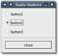
Launch the program from a shell. When you change the radio button selected the button's label text is sent to stdout.
| Copyright © 2004-2005 The XFC Development Team | Top |
XFC
4.4 |